Back to: Home British Views Realistic Travels
Realistic Travels Company Logos and Card Types
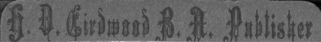
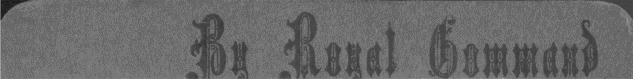
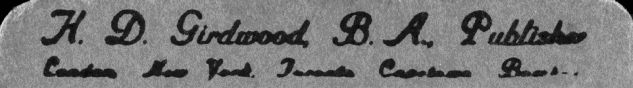
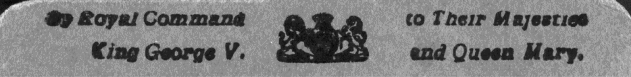
The logos on Girdwood’s cards show their relative ages. During the Boer War (1899-1902), the company logo was Girdwood’s name in an Old English font on the right and “By Royal Command” on the left. Following the coronation of King George V in 1910, Girdwood changed the font, added the cities where he had offices (London, New York, Toronto, Capetown, and Bombay), and added the names of King George V and Queen Mary. The latter style is rarely seen on Great War stereoviews; such cases probably represent use of a rediscovered stock of older cards. Early logos are found on curved, dark gray mounts of good quality.
Logo and Royal Command Types Prior to the Great War
|
|
Boer War-era logo and Royal Command box |
|
|
|
|
|
Logo and Royal Command box prior to adoption of Realistic Travels name (An earlier version of the command box was in script and read “...to Their Imperial Majesties...”) |
|
|
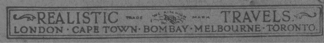
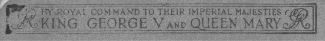
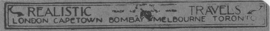
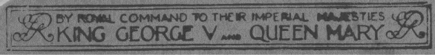
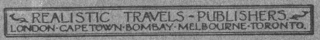
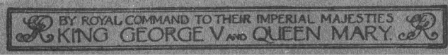
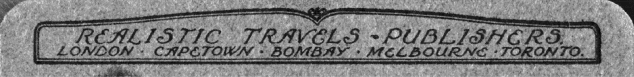
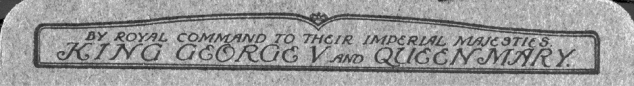
Girdwood adopted the trade name of Realistic Travels before the war. There are four different types of cards distinguished by the company logos and Royal Command boxes. All reflect the deletion of the New York office and addition of Melbourne. The earliest, Type I, has a serifed font on flat or slightly curved buff or light gray mounts of somewhat lesser quality than the earlier mounts. The printing is often poor, with indistinct letters and poor positioning the norm. It was probably used for a few years after the war. Following use of a transitional marking (Type II) in a sans-serif font that also often failed to print properly, Girdwood adopted a version of the logo with a sans-serif font that usually printed clearly on good-quality curved gray or light brown mounts (Type III). Type IV, the final style, uses an ornate font in stylized boxes and is found on light brown mounts of excellent quality. For all types, the Realistic Travels logo customarily appeared on the left and the Royal Command box on the right, although reversed positions are common. Similarly, orientation of the boxes varied, with the bottom of the text towards the center or outside of the mount.
Logo and Royal Command Types, Great War Period
|
|
Type I: Serif font. Top line includes open ornaments and a “We Aim High” trademark. Quality of printing is usually poor. |
|
|
|
|
|
Type II: Sans-serif font. The ornaments on the top line are filled in and a version of the trademark is present. Printing of this transitional logo is often poor. |
|
|
|
|
|
Type III: Sans-serif font with ornaments similar to those of Type II. The trademark is gone. Printing quality is usually good. |
|
|
|
|
|
Type IV: An ornate font in stylized boxes without further ornamentation or trademarks. Quality is excellent. |
|
|
Copyright markings are associated with these four types.
Copyright © 2007 Great War Photos. All rights reserved